Look, we get it. Soft colors get a bad rap. Somewhere along the way, “neutral” became synonymous with “blah,” and pastels were unfairly boxed in as baby-room-only territory. But guess what? The soft color revolution is here—and it’s quietly fabulous.
 |
So before you scroll past yet another gentle hue thinking it won’t make an impact, let us stop you right there. Soft pastel color palettes are the unsung heroes of modern design. They're subtle, yes—but never timid. Elegant, not empty. Calming, not characterless.
And trust us, these shades have a lot to say.
Ready to rethink your stance on muted tones? Here are three chef’s kiss color palettes that prove soft doesn’t mean snooze.
🍑 1. Desert Peach & Pistachio Dream
 |
| Peach Fuzz-Soft Sage-Dusty Pistachio-Warm Sand |
 |
 |
 |
Imagine the color of a pistachio gelato melting in a desert sunset. Yep, that’s the vibe. This palette brings warmth and a hint of unexpected whimsy. Use it in a living room to make it feel like a sunny afternoon all year long, or try it in a kitchen for a fresh, organic feel that doesn’t scream “farmhouse cliché.”
Pair with natural textures like rattan, raw wood, and linen. Throw in some matte black hardware for contrast. Now you’ve got a look that’s grounded and grounded-in-style.
Interior color tip: Paint your trim peach and your walls a dusty sage for a twist that feels designer-approved, but still totally livable.
🌫️ 2. Cloud Cover Cool
 |
| Smoky Lavender-Silver Mist-Powder Blue-Muted Charcoal |
 |
 |
 |
This one’s for those of you who live for that cozy, moody calm—but still want your space to feel bright and breathable. It’s got a cool-tone backbone that works magic in bedrooms, offices, and reading nooks.
Layer different shades of grayish pastels for depth without heaviness. Think Scandinavian minimalism meets rainy-day romance.
Soft pastel color palettes like this one are your secret weapon for adding personality without sacrificing serenity.
Add cozy textures (hello, chunky knits and boucle) and a little shimmer—maybe in the form of a brushed nickel light fixture or a silvery mirror—to reflect the softness in style.
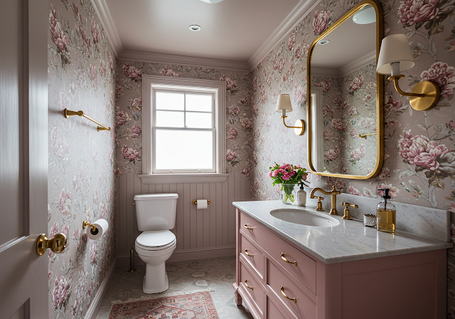
🌸 3. Rosy Revival

Blush Pink-Creamy Taupe-Warm White-Mauve Mist
 |
 |
 |
Soft pinks are having a moment—and no, it’s not just about Barbiecore anymore. When done right, they exude sophistication with a whisper, not a shout. This palette leans romantic and timeless, like a vintage French bakery with Wi-Fi and great lighting.
Perfect for powder rooms, primary bedrooms, or any nook that needs a dose of gentle glamour.
Want a bold move with a soft heart? Paint your ceiling in a mauve mist and keep the walls a cozy cream. You’ll thank us later.
This combination makes for an interior color scheme that feels both vintage and refreshingly modern. A little floral wallpaper never hurt either—just sayin’.
Final Thoughts
So, are soft colors still boring? Not even close. In fact, they’re some of the most versatile, emotional, and inspiring shades in the design world. Whether you're channeling sunlit deserts, cloudy-day calm, or a soft Parisian blush, soft pastel color palettes have the power to transform your space from basic to breathtaking.
Subtle is the new statement—and it’s looking really, really good on your walls.